Helvetica
Variants
-
-
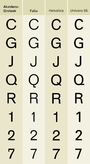
A large number of variants of Helvetica were rapidly released to expand on its popularity, including new weights and languages. Linotype confessed by the time of a 1976 advertorial that things had become somewhat confused: "the series was not planned as a whole from its conception...the series is not as uniform as Univers".Helvetica Light
Helvetica Light was designed by Stempel's artistic director Erich Schultz-Anker, in conjunction with Arthur Ritzel.
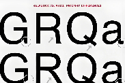
Helvetica InseratHelvetica Inserat (German for advertisement) is a version designed primarily for use in the advertising industry: this is a narrow variant that is tighter than Helvetica Black Condensed. It gives the glyphs an even larger x-height and a more squared appearance, similar to Schmalfette Grotesk. Adobe's release notes date it to 1966 and state that it originated with Stempel.
-

-
Helvetica Compressed (1966)
Designed by Matthew Carter and Hans-Jürg Hunziker for cold type. It shares some design elements with Helvetica Inserat, but uses a curved tail in Q, downward pointing branch in r, and tilde bottom £. Carter has said that in practice it was designed to be similar to Schmalfette Grotesk and to compete in this role with British designs Impact and Compacta, as this style was popular at the time. Carter, who also later designed Helvetica Greek, had designed a modernised version of Akzidenz-Grotesk for signage at Heathrow in 1961, and commented later "if we'd known about [Helvetica] I'm sure we would have used it, since it's a much better typeface than the one I drew. But the typesetting trade was very conservative then, and new type designs traveled slowly." The family consists of Helvetica Compressed, Helvetica Extra Compressed and Helvetica Ultra Compressed faces. It has been digitised, for instance in the Adobe Helvetica release.
Helvetica Rounded (1978)
Helvetica Rounded is a version containing rounded stroke terminators, released for bold weights. Linotype's release notes date it to 1978.
-
Helvetica Narrow
Helvetica Narrow is a version where its width is between Helvetica Compressed and Helvetica Condensed. This computer font was developed when memory space in electronic printers was very scarce, so it was created by mathematically squashing Helvetica to 82% of the original width, resulting in distorted letterforms, with vertical strokes narrowed but horizontals unchanged. Because of the distortion problems, Adobe dropped Helvetica Narrow in its release of Helvetica in OpenType format, recommending users choose Helvetica Condensed instead.
Helvetica Textbook
Helvetica Textbook is an alternate design of the typeface, which uses 'schoolbook' stylistic alternates to increase distinguishability: a seriffed capital 'i' and 'j' to increase distinguishability, a 'q' with a flick upwards and other differences, such as the digits '1' and '4' similar to how handwritten digits are. The letters 'a', 't', 'u', and the digits '6' and '9' are replaced with designs similar to those in geometric sans-serifs such as those found in Futura, Akzidenz-Grotesk Schulbuch, and Avant Garde (except for 'u'). FontShop's FF Schulbuch is similar.
-
Language variants
Helvetica Greek has gone through several versions. Letraset designed a semi-official version for their dry transfer lettering system, available by 1970, which sold well but was considered unidiomatic by Linotype.Linotype published a 1971 version designed by Matthew Carter which was available for phototypesetting and so for general purpose printing such as extended text. Carter felt in 1974 that the Letraset version was "a poor thing" and Linotype's version was "the real one" but that Letraset's was well-enough accepted in Greece that he felt it had "caused resistance to our version". Linotype published a new version in 2001 designed by John Hudson at Tiro Typeworks.
-
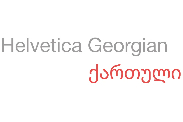
Helvetica World
Helvetica World supports Arabic, Cyrillic, Greek, Hebrew, and Vietnamese scripts.This typeface family consists of four scalable fonts in two weights and one width, with complementary italics. The Arabic glyphs were based on a redesigned Yakout font family from Linotype. Latin kerning and spacing were redesigned to have consistent spacing. John Hudson of Tiro Typeworks designed the Hebrew glyphs for the font family, as well as the Cyrillic, and Greek letters.