Helvetica
Helvetica
-
"Helvetica can't do everything...it canbe really weak in small sizes. Shapesike 'C'and 'S' curl back intothemselves, leaving tight"apertures"_the channels of whitebetween a letter's interior andexterior...The lowercase'e', the mostcommonletter in English and manyotherlanquages, takes an especiallyunobliging form. These and otherletters can be a pixel away from beingsome other letter."
--Tobias Frere-Jones -
Helvetica is the ieans, and Univers thedinner iacket. Helvetica is here to stay.
--Adrian Frutiger -
The whole point with type is for younot to be aware it is there. lf youremember the shape of a spoon withwhich you iust ate some soup, thenthe spoon had a poor shape.
--Adrian Frutiger -
Helvetica is the 'dictator of typefaces' — it permits no individuality, every letter must march in perfect uniformity.
--Neville BrodyThe letters of Helvetica were not ‘designed’—they were ‘calculated.’ It is the ultimate embodiment of Swiss precisionism.
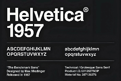
--Emil Ruder - Helvetica, also known by its original name Neue Haas Grotesk, is a widely-used sans-serif typeface developed in 1957 by Swiss typeface designer Max Miedinger and Eduard Hoffmann.
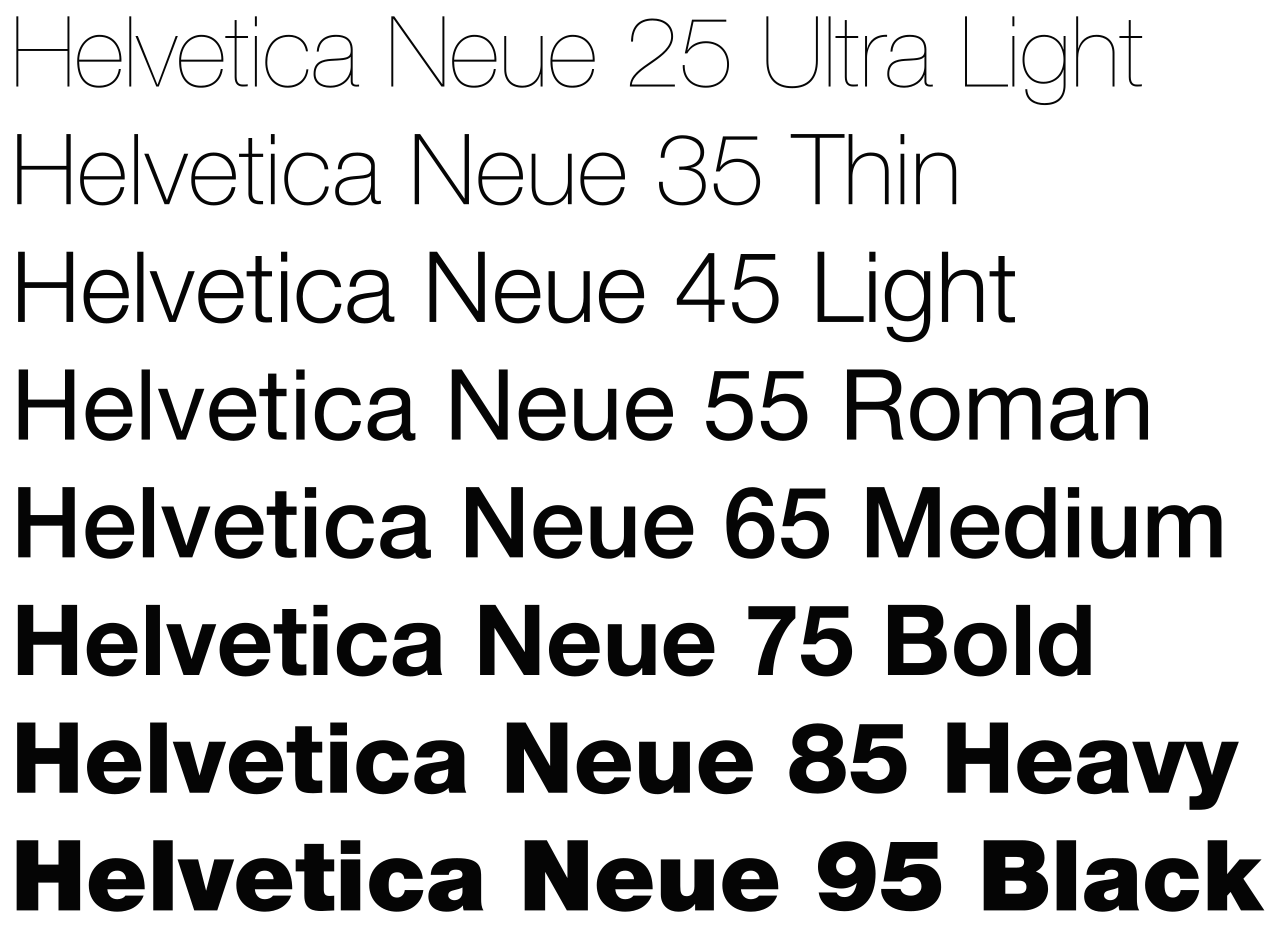
- Helvetica is a neo-grotesque design, one influenced by the famous 19th-century (1890s) typeface Akzidenz-Grotesk and other German and Swiss designs.Its use became a hallmark of the International Typographic Style that emerged from the work of Swiss designers in the 1950s and 1960s, becoming one of the most popular typefaces of the mid-20th century.Over the years, a wide range of variants have been released in different weights, widths, and sizes, as well as matching designs for a range of non-Latin alphabets. Notable features of Helvetica as originally designed include a high x-height, the termination of strokes on horizontal or vertical lines and an unusually tight spacing between letters, which combine to give it a dense, solid appearance.
-
If you have no intuitive sense of desian, then calyourself an "information architect" and only useHelvetica.
--David Carson -
Helvetica is 'default modernism'—it's so perfect that people forget it's actually a design.
--Paul Rand - Developed by the Haas'sche Schriftgiesserei (Haas Type Foundry) of Münchenstein (Basel), Switzerland, its release was planned to match a trend: a resurgence of interest in turn-of-the-century "grotesque" sans-serifs among European graphic designers, that also saw the release of Univers by Adrian Frutiger the same year. Hoffmann was the president of the Haas Type Foundry, while Miedinger was a freelance graphic designer who had formerly worked as a Haas salesman and designer.
- Originally named Neue Haas Grotesk (New Haas Grotesque), it was soon licensed by Linotype and renamed Helvetica in 1960, which in Latin means 'Swiss', from Helvetia,capitalising on Switzerland's reputation as a centre of ultra-modern graphic design.