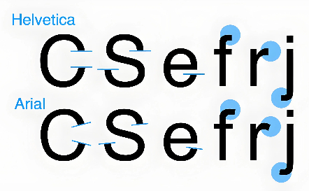
Helvetica
Helvetica Derivative Designs
-
Zhukov and Kurbatov version
In 1963, two students at the Moscow Print Institute designed their own version of Helvetica, one of whom, Maxim Zhukov, would become one of the Soviet Union's most prominent typographers. Zhukov and his partner Yuri Kurbatov used upright cursive forms for several of the lowercase letters, which allowed for several of the Helvetica forms to be transferred more directly into Cyrillic.
Their version received widespread use in phototypesetting, especially among other students at the Moscow Print Institute, despite never being commercially released. Zhukov and Kurbatov attempted to publish the typeface in 1964 but were rejected due to the font's being too closely associated with capitalism; this was one of the major factors as to why an official Cyrillic Helvetica, Pragmatica, would not be released in the Soviet bloc until perestroika in 1989.
Unica
Unica by Team'77 (André Gürtler, Christian Mengelt and Erich Gschwind) is as a hybrid of Helvetica, Univers and Akzidenz-Grotesk. It was developed in the 1970s for electronic on-screen phototypesetting and released in 1980. As phototypesetting was soon replaced by desktop publishing and because of a legal dispute, the typeface rapidly disappeared from the market. In mid 2010s, two digital versions were released: the Swiss foundry Lineto released LL Unica77 with input from Christian Mengelt, while Linotype released Neue Haas Unica.
Helvetica Flair and others
Designed by Phil Martin at Alphabet Innovations, Helvetica Flair is an unauthorised phototype-period redesign of Helvetica adding swashes and unicase-inspired capitals with a lower-case design. Considered a hallmark of 1970s design, it has never been issued digitally. It is considered to be a highly conflicted design, as Helvetica is seen as a spare and rational typeface and swashes are ostentatious: font designer Mark Simonson described it as "almost sacrilegious". Martin would later claim to have been accused of "typographic incest" by one German writer for creating it.
Helvetica Flair was one of several derivative fonts created by Martin in the 1970s (and a particularly legally questionable one, since it was directly named 'Helvetica').Martin also drew 'Heldustry', a fusion of Helvetica with Eurostile, and 'Helserif', a redesign of Helvetica with serifs, and these have both been digitised.
-
Forma (1968)
Created by Aldo Novarese at the Italian type foundry Nebiolo, Forma was a geometric-influenced derivative of Helvetica with a 'single-storey' 'a' and extremely tight spacing in the style of the period. It was offered with 'request' stylistic alternatesimitating Helvetica more closely. Forma has been digitised by SoftMaker as "Formula" and (in a much more complete version with optical sizes) as Forma DJR by David Jonathan Ross at Font Bureau for Tatler magazine.
Manoptica
Manoptica (1973) was an early effort to adapt Helvetica to the Thai script. It is named after and designed by Manop Srisomporn, who designed several typefaces for Thai using the same innovations he used for Manoptica (such as an adaptation of Eurostile). It was highly influential in Thai typography in that it popularized the removal of the small loops and other flourishes that had theretofore been distinguishing marks on Thai characters and adopted letter forms that bore strong resemblance to Latin letters. It became a widely popular style in advertising and influenced other simplified typefaces for Thai in the following decades. The adoption of loopless typefaces remains a source of controversy in Thai typography.
Shatter LET (1973)
Designed by Vic Carless, Shatter assembles together slices of Helvetica to make a typeface that seems to be in motion, or broken and in pieces. It was published by Letraset after jointly winning their 1973 competition to design new fonts.
Writing in 2014, Tim Spencer praised the design for its ominous effect, writing that it offered "glitch-like mechanical aggression [and] cold, machine-induced paranoia. It attacked the Establishment's preferred information typography style with a sharp edge and recomposed it in a jarring manner that still makes your eyes skitter and your brain tick trying to recompose it. Shatter literally sliced up Swiss modernist authority."